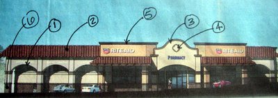
So we already know that the proposed Olivenhain Rite Aid is FUGLY, but why?
The Encinitas planning commission rejected the plans for being too "boxlike", but is that really the problem here?
1. Like most strip malls this Rite-Aid has non structural stud framed arches. No masonry here, they are just for looks...and they look lame.
2. The Mansard roof, a favorite of McDonald's. Lame. With spanish tile which is sooooo played out it's not even funny.
3. This curved papapet is purely decorative. The origin of the parapet is self defense. I guess if this Rite Aid ever comes under siege the pharmacist and clerks can go on the roof and defend themselves.
4. Quatrefoil window. Qautrefoils are often found on mission revival buildings, you see them on every strip mall in California. It has Christian origins, a symbol of good luck and yes, most of the time they are actual functional windows unlike here which is a stucco wall. Lame.
5. Molded foam cornice, pointless.
6. Brick veneer. Since this is earthquake land we don't use real bricks so slap on some veneer that will trick people into thinking brick was used in this building. Huh?
This Rite Aid is a generic version of Mission Revival, influenced by California's rich history. In my opinion mission revival strip malls openly mocks California history. It is used as a weak attempt to "theme" the entire southwest. Remember, Rite Aid is based out of Pennsylvania. They are not exactly Padres fans.
The funny thing about all these mission revival gimmicks is that they just drive up the building cost. Streamline it my man.

J.P. has always been a stickler for authenticity.
ReplyDeleteGood comments, JP. With all those curves, though, it doesn't look "boxy" to us.
ReplyDeleteYou could send a link to your blog to Rite-Aid headquarters. Maybe they could use your dear wife for a redesign?
Kinda funny, she just got hired to do a Long's drug store on Friday. These corporate types don't give architects a lot of wiggle room so I'm interested in seeing if she can make it cool or not.
ReplyDeleterite aid had a big class action lawsuit against it because they advertised low price sale items but then charged high prices for those items.
ReplyDeleteI bet those rancho houswives will keep the pharmacist busy better buy stock in xanax and viagra.
ReplyDeletebrah - even with all the foo foo it still looks like a big rectangle to me. I had to work on garbage like that earlier in my career. Every Architect and designer should, so they have a good idea of just how fake that shit really is. It's a disgusting waste of money and a remarkable misuse of design opportunity. Tell Y good luck convincing Longs to shed the faux stylings. I will be impressed if she can shake the corporate anchors out of the ground.
ReplyDeleteHopefully we will see you the first week of Sept. when we will be in town.
Aloha